Trends & Inspiration
Top 10 Lists, Interior Design Trends & Recent Editorial.
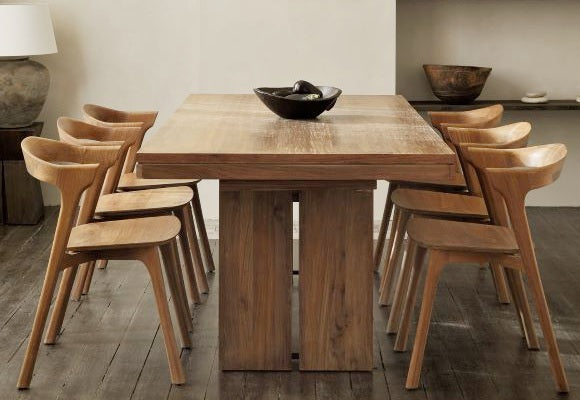
The Best of the Best
We’ve rounded up our favorite designs, suitable for spaces large & small, guaranteed to elevate any interior.
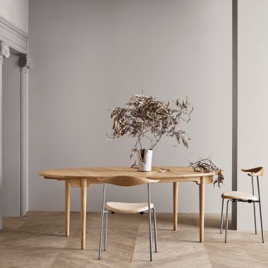
Helpful Design Tips
Read our helpful tips and bright ideas for selecting the best modern designs, ideal for creating an inspired living space.
Striking Modern Motifs
From faceted furniture to sustainable lamps, we look at the modern design motifs that are currently front and center.
The Latest in Design
Designer interviews and inspired product releases are featured in our roundup of contemporary design news.